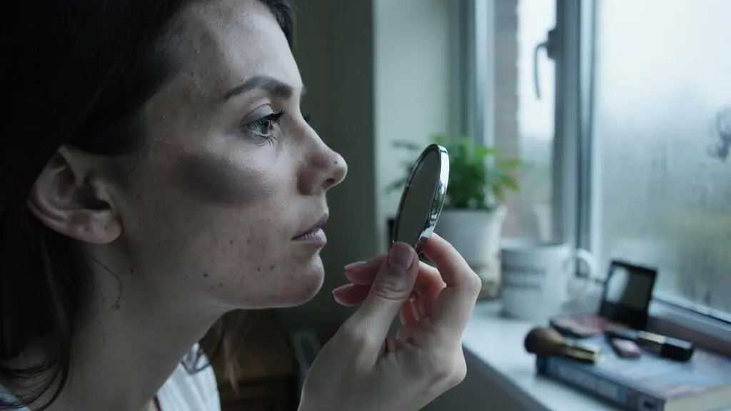
Your cheek contour looks beautifully blended in the bathroom mirror. Then you step outside on a cloudy British morning and notice a brown stripe beneath your cheekbone. The product has not necessarily changed. The lighting has changed how its colour, placement and edges appear.
Warm indoor bulbs can make contour shades look softer or more flattering than they appear under neutral or cool daylight. Window light may reveal an undertone mismatch, a sharp boundary or excess pigment that was difficult to notice during application. Daylight itself is not always blue or diffused, however: its appearance depends on cloud cover, time of day and surroundings.
The solution is usually not more blending or another layer of foundation. Natural-looking contour depends on choosing a believable shadow colour, placing it within the face’s existing structure and checking the finished effect in the lighting where it will be worn.
For everyday UK makeup, especially during a commute or office day, a small amount of correctly positioned contour often creates more convincing definition than a heavily sculpted finish.
Natural contour in daylight: the essentials
- Choose a muted contour shade that resembles your natural facial shadows, not simply a darker version of your foundation.
- Keep cheek contour concentrated towards the outer cheekbone, with softly diffused edges and minimal product near the centre of the face.
- Prepare your skin, layer compatible formulas and check your makeup by a window before deciding whether more colour or setting product is necessary.
- Why Can the Wrong Contour Undertone Make Your Face Look « Muddy » in Photos?
- How to Do Soft Contour With 2 Finger-Widths of Placement So It Never Looks Strip-y?
- Cream or Powder Contour: Which Blends Better on Dry Skin Without Skipping?
- The Placement Mistake That Makes Cheeks Look Droopier After 40
- When Should You Apply Contour if You Also Use Bronzer and Blush to Avoid Overdoing It?
- Neutral, Warm, or Cool: Which Undertone Stops « Mask Face » in Daylight?
- Setting Spray or Powder: Which Keeps Makeup Fresher During a Full Office Day?
- Why Does Your Makeup Look « Done » at 8am but Tired by 3pm?
Why Can the Wrong Contour Undertone Make Your Face Look « Muddy » in Photos?
The wrong contour undertone can make your face look muddy because its pigments contrast with your skin instead of resembling a natural shadow. A shade that seems subtle under warm bathroom lighting may appear grey, orange or excessively brown in daylight. Photographs can make these differences easier to notice, particularly when the contour has a defined edge.
Contour works through an illusion: a muted colour applied strategically makes an area appear to recede. Unlike bronzer, which introduces warmth, contour should suggest depth without attracting attention to the makeup itself.
According to Allure‘s contour kit and application adviceAllure’s contour kit and application advice, contouring focuses on shaping facial structure, while bronzing adds warmth to areas where sunlight would naturally reach the skin. This distinction helps explain why a convincing contour shade is not necessarily the same colour as a bronzer.
A common mistake is choosing contour simply by selecting a foundation shade several levels darker. Foundation is intended to resemble skin colour; contour needs to resemble the shadow created by facial structure. Those two colours may belong to different undertone families.
Very grey contour can look ashy on some complexions, while reddish or orange-brown contour may resemble an accidental patch of bronzer. Neither outcome is inevitable for a particular skin tone. The result depends on pigment saturation, surrounding makeup and the skin’s existing colour.
Lighting also matters. Warm artificial lighting can change how a product’s undertones appear relative to the skin. Cool, overcast daylight may reveal that mismatch more clearly, although it does not universally make grey pigment look darker or browner.
To diagnose the problem, apply a small amount of contour to one cheek and leave the other cheek untouched. Face a window in indirect daylight and take a photograph without flash. Compare the applied area with the natural shading beneath the opposite cheekbone.
If the product resembles a separate grey, orange or dark-brown patch, try a different undertone or a less saturated shade before adding more pigment. If its colour looks appropriate but the border remains obvious, adjust placement and blending instead.
Muddiness caused by colour mismatch cannot reliably be corrected through blending alone. Excessive blending may spread the unsuitable shade across a larger area.
Once the colour resembles your own facial shadows, the next challenge is making its placement disappear into the cheek rather than forming a visible stripe.
How to Do Soft Contour With 2 Finger-Widths of Placement So It Never Looks Strip-y?
For soft cheek contour, use approximately two finger-widths as a starting guide for keeping the strongest pigment near the outer cheekbone, rather than dragging a line towards the mouth. Apply a small amount of product, soften its edges in both directions and check the result in daylight. The measurement is adjustable, not a universal placement rule.
Traditional contour tutorials often encourage drawing a line from the ear towards the mouth. This can create a dramatic sculpted effect, but it also makes the contour’s shape recognisable when viewed in natural light.
For a softer daytime finish, locate the cheekbone with your fingertips. Begin near the outer cheek, leaving roughly a two-finger-width reference area from the ear to help judge where the main contour should sit. Keep the strongest colour towards the hairline and avoid taking a dark line into the apple of the cheek.
The exact starting point depends on face size, cheekbone shape and the width of your fingers. Treat the technique as a placement aid rather than a fixed anatomical measurement.
Apply one short stroke or a few small dots. Then use a clean brush, sponge or fingertip to diffuse the pigment. Blend the upper border gently towards the cheekbone and soften the lower border without carrying the entire shadow down towards the jaw.
The aim is a gradient: most of the colour remains within the intended shadow zone, while its edges become progressively less noticeable.
Stripes often appear when too much product is deposited in a narrow line and blending is concentrated on one side. Dragging the product downwards may enlarge the brown area without actually softening the upper edge.
A smaller brush can help control the initial placement, while a slightly larger clean brush can soften the perimeter. Avoid aggressive sweeping that removes colour from the intended zone and distributes it elsewhere.
The final check should happen facing a window, without flash or strong overhead lighting. Look at the cheek from the front and from a three-quarter angle. The contour should merge naturally with the existing shadows near the ear and hairline.
If a separate shape remains visible, use the clean side of a sponge to lift excess colour or soften the edge with whatever base product remains on your application tool.
Placement creates the shape, but the formula determines how easily that shape can be softened, particularly when the skin is dry.
Cream or Powder Contour: Which Blends Better on Dry Skin Without Skipping?
Cream contour is often easier to work into dry skin when the complexion has been moisturised and the underlying makeup remains compatible. Powder contour can be more convenient for controlled placement, but may catch on flaky or uneven areas. Neither formula always blends better: skin preparation, foundation texture and application technique are just as important.
Dry skin creates a particular challenge because products may settle unevenly wherever the surface is rough or dehydrated. This can produce patchy colour that becomes more noticeable under daylight.
The American Academy of Dermatology advice on skin-care application orderAmerican Academy of Dermatology advice on skin-care application order recommends cleansing and applying moisturiser and/or sunscreen before makeup. This supports preparing the skin first, although it does not establish that one contour formula performs better than another.
Allow moisturiser and sunscreen to settle sufficiently for comfortable, even application. There is no universally required waiting time: the appropriate interval depends on the products and how they behave together.
Cream contour usually gives more working time before the edges are fully blended, depending on its formula. It can create a skin-like finish when tapped into the complexion rather than dragged across it.
Powder contour can provide precise, buildable placement, especially over an already set base. On dry areas, however, a heavily loaded brush may deposit unevenly or emphasise visible flakes.
The following comparison can help guide your choice.
| Consideration | Cream contour | Powder contour |
|---|---|---|
| Dry patches | May blend more smoothly over well-prepared skin | May catch on flaking or textured areas |
| Base compatibility | Often works well over unset liquid or cream foundation | Often applies more evenly over a lightly set base |
| Daylight appearance | Can provide a soft, skin-like finish | Can provide a muted finish but may look powdery if overapplied |
| Wear and touch-ups | May move or wear away depending on formulation | May offer controlled placement, but longevity varies |
| Application | Tap and diffuse with a suitable tool | Use a lightly loaded brush and build gradually |
A useful compromise is to apply a thin layer of cream contour, blend it completely and add a very small amount of compatible powder only where extra setting is needed. This is an optional technique rather than a proven universally superior method.
Be particularly careful when applying cream contour over a heavily powdered or very matte foundation. The product may drag, lift the base or create visible patches. Conversely, applying powder before an unset cream layer has settled can produce uneven texture.
For a full office day, choose the formula that blends cleanly with your base before prioritising potential longevity. A product that looks patchy immediately is unlikely to become more convincing after additional setting.
Once the texture behaves well, contour placement can be adjusted further to suit changes in facial structure without exaggerating them.
The Placement Mistake That Makes Cheeks Look Droopier After 40
Placing contour too low beneath the cheekbone can visually pull the cheeks downwards, particularly when natural mid-face volume has changed with age. A softer shadow positioned higher on the outer cheekbone and blended towards the temple may create a more lifted impression. The principle is about facial proportions, not a rule that everyone over 40 must follow.
Ageing affects facial structure differently from person to person. Changes in skin elasticity, fat distribution and bone structure can alter how existing shadows appear, but chronological age does not determine the ideal makeup placement.
On a face with less fullness through the mid-cheek, adding a dark band beneath an already pronounced hollow may exaggerate the impression of depth. Rather than suggesting a lifted cheekbone, the contour can make the lower portion of the face appear visually heavier.
A simple adjustment is to move the contour slightly higher and reduce its intensity. Locate the cheekbone by touch, then apply a short, light stroke near its outer section. Angle the blending subtly upwards towards the temple instead of following a steep line towards the mouth.
Keep the strongest colour away from the central cheek and nasolabial area. Strong darkness beside an existing facial fold can create additional contrast that draws attention to the fold rather than to the cheekbone.
The most useful test involves comparing two placements rather than assuming that one is correct for every mature face. On one side, place a small amount of contour in the traditional hollow. On the other, try a slightly higher, softer application. Judge both sides in the same daylight.
Smiling can help identify the prominent portion of the cheek, although final placement should also be assessed with the face relaxed. A shadow that appears flattering only while smiling may sit differently during ordinary expression.
Less product, placed more precisely, can create stronger visual definition than a large dark area. This is especially relevant when attempting a natural finish instead of pronounced evening contour.
There is no need to pursue an artificially lifted shape if the objective is simply to enhance existing cheek structure. Wider, narrower, fuller and more angular faces will require different adjustments.
Once the contour complements the cheek’s natural shape, bronzer and blush can add warmth and colour without covering the carefully created definition.
When Should You Apply Contour if You Also Use Bronzer and Blush to Avoid Overdoing It?
Apply contour early enough to establish the facial shadow before building warmth with bronzer and colour with blush. For cream products, contour can often follow skincare and base makeup, while powders usually work better after compatible cream layers. The important principle is to maintain distinct placement zones and avoid stacking all three colours heavily on the same area.
Contour, bronzer and blush serve different visual purposes. Contour suggests recession beneath or around facial features. Bronzer adds warmth to areas that might naturally catch the sun. Blush introduces colour to the cheeks and helps the complexion appear lively.
A practical arrangement keeps contour near the outer cheekbone, bronzer lightly across suitable high points such as the outer forehead and upper cheeks, and blush on the cheek area above or beside the contour.
Some overlap is normal, and careful overlap can help create a smooth transition. The problem begins when multiple saturated colours occupy the same narrow strip.
Professional makeup artists discussed in Allure’s expert advice on makeup application order recommend creating shadow with contour before introducing blush colour. The same guidance highlights the usefulness of applying cream products before powder formulas, rather than repeatedly switching between the two textures.
This means there is no requirement to apply contour directly to bare skin in every routine. If foundation or concealer is part of your base, a compatible contour can be applied afterwards. The preferred order may change depending on whether the products are creams, liquids or powders.
For example, when using three cream products, start with a minimal contour application and soften the edges. Add a small amount of bronzer where warmth is wanted, then place blush where it complements the cheekbone. If using powder bronzer and powder blush, allow the underlying cream layers to settle first.
Build each product more lightly than you would if wearing it alone. The combined effect is what matters, and warm bathroom lighting may make that combined colour appear less distinct than it does near a window.
Very fair skin can show the difference between bronzer and contour particularly clearly, but this does not mean every fair complexion needs both. If bronzer alone gives the desired effect, an additional contour step may be unnecessary. If warmth is present but structural definition is missing, a small amount of neutral contour can help.
A five-step daylight contour check
- Apply a small contour swatch near the outer cheekbone and check it facing a window. Your result: a shade that resembles a natural shadow rather than a separate colour patch.
- Use the two-finger placement reference and keep the strongest pigment towards the outer cheek. Your result: a short, controlled contour zone that stops before the central cheek.
- Blend with a clean tool until the visible upper and lower edges soften. Your result: a gradient without a distinct painted line.
- Add bronzer and blush in their intended zones, using light layers. Your result: warmth, cheek colour and shadow remain visually distinguishable.
- Check the finished face in indirect daylight from the front and side. Your result: a final reference photograph showing whether the complete makeup looks natural outside the bathroom.
With placement and layering under control, the next decision is selecting the undertone that blends into the complexion instead of looking like a visible mask.
Neutral, Warm, or Cool: Which Undertone Stops « Mask Face » in Daylight?
A contour undertone helps prevent a mask-like appearance when it resembles the natural shadows of the face without introducing an obvious contrasting colour. Neutral, cool and softly warm shades can all work, depending on the complexion. The best choice is usually the one that becomes least noticeable when blended and examined in daylight, rather than the shade that looks most dramatic in its packaging.
« Mask face » describes a makeup finish with visible boundaries between applied colour and surrounding skin. With contour, the effect may appear as an orange band, a grey stripe or a dark outline that does not belong to the face’s natural shadow pattern.
A contour can match the overall depth of your complexion while still having the wrong undertone. Conversely, a slightly cooler or more neutral shade may look convincing when applied lightly, even if it seems unusual beside your foundation.
Undertone selection should consider both the skin and the kind of shadow being imitated. The following guide offers useful starting points, not fixed rules.
| Complexion characteristics | Undertone to test | What to watch for |
|---|---|---|
| Warm-leaning skin | Neutral or softly warm muted brown | Excessively orange or reddish colour |
| Olive-leaning skin | Neutral, muted brown or subtle grey-brown | Warm pigment that appears orange beside olive tones |
| Very fair, cool-leaning skin | Low-saturation neutral or softly cool taupe | Dark grey bands or excessive colour depth |
| Deep skin tones | A sufficiently deep, muted brown with a compatible undertone | Ashiness, insufficient depth or an overly warm cast |
| Neutral skin | Balanced muted brown, adjusted to the natural shadow | Strong colour contrast in either direction |
The categories overlap. Olive complexions can be warm, neutral or cool, and deeper skin tones vary widely in undertone. The table is therefore a testing guide rather than a substitute for observing the actual face.
For a practical swatch test, choose three contour shades with similar depth but different undertones. Apply small, separate swatches along the lower jaw or an area where the natural skin colour is visible, then soften their edges.
Move into indirect daylight and compare the swatches. The most suitable shade is often the one that blends into the skin without looking orange, grey or artificially dark. Confirm the result with a small cheek application, because the jawline is not identical to the cheek’s natural shadow zone.
Warm indoor bulbs can make certain warm-toned products look harmonious while disguising their contrast with the surrounding skin. Daylight may reveal that contrast, but there is no single permanent colour characteristic of UK daylight. Direct sunshine, cloud cover and reflected light produce different viewing conditions.
A contour should behave like a shadow, not a second foundation shade. This is why checking a product in the lighting where it will be worn is more useful than relying exclusively on a shop swatch or bathroom mirror.
Once the colour is convincing, setting techniques can help preserve the finish throughout the working day without adding unnecessary texture.
Setting Spray or Powder: Which Keeps Makeup Fresher During a Full Office Day?
Setting powder is generally useful when the priority is absorbing excess oil and securing makeup in particular areas, while setting spray can help maintain or unify the finished look depending on its formulation. For a full office day, neither is automatically better. A targeted approach usually makes more sense than applying heavy powder or repeated spray layers across the entire face.
Oilier areas often benefit from a small amount of setting powder, particularly around the nose, forehead and chin. Applying powder heavily across dry cheeks, however, may make texture more apparent and reduce the softness of cream contour.
Setting sprays work differently. Some contain film-forming ingredients designed to support makeup wear, while others mainly influence the finish or provide a refreshing sensation. Their effectiveness depends on the actual formula, so a spray should not automatically be treated as a replacement for oil control.
The distinction is discussed in Allure’s comparison of setting powders and setting sprays, which explains their different functions and the value of applying powder selectively rather than covering the whole face indiscriminately.
For contour worn over dry or mature skin, consider setting only the areas that need it. If the contour remains secure without powder, leave it alone. If cream pigment tends to move, use a very light layer of compatible powder applied with a soft brush.
A finishing mist can be applied afterwards if it works well with the foundation and other products. This combination is a practical option, not a guarantee of superior longevity.
UK office routines frequently involve changes of environment: outdoor air during the commute, heated indoor spaces and different lighting conditions throughout the day. These changes may influence skin comfort, oiliness and how makeup appears, although they do not establish that every contour product will oxidise or shift.
If the T-zone becomes shiny at lunchtime, blot gently before considering additional powder. Repeatedly spraying the whole face will not necessarily remove oil or restore contour that has physically worn away.
For a dry cheek that remains well blended, avoiding unnecessary touch-ups can preserve the natural finish better than trying to renew every product.
It also helps to distinguish between real deterioration and a lighting difference. A contour that looks sharper by an afternoon window may have looked equally sharp in daylight earlier, even if the morning bathroom mirror suggested otherwise.
Keeping contour fresh is easier when the morning application is light and stable, but understanding the changes between 8am and 3pm provides the most useful information for adjusting the routine.
What to remember before your afternoon makeup check
- Do not assume that makeup looks tired simply because the contour has faded; changing light can also reveal colour and placement issues that were present from the beginning.
- Check individual products separately: contour, bronzer, blush and foundation may not wear at the same rate or in the same areas.
- Base future adjustments on a consistent daylight comparison rather than adding more powder, bronzer or contour automatically.
Why Does Your Makeup Look « Done » at 8am but Tired by 3pm?
Makeup can look polished at 8am but tired by 3pm because oil, facial movement, transfer and gradual wear change how products sit on the skin. Contour, blush and bronzer may fade at different rates, affecting the balance of warmth and definition. Different morning and afternoon lighting can also make an unchanged makeup look appear noticeably different.
Consider a typical office-day routine. At 8am, foundation, contour, bronzer and blush have just been applied. Their edges are fresh, the base looks even and the overall result appears balanced under bathroom lighting.
Several hours later, the T-zone may be shinier, foundation may have worn around the nose and some cheek colour may have faded. If bronzer remains relatively visible while contour or blush has softened, warmth can become more prominent than the original structural definition.
This is one possible wear pattern, not a universal sequence. Some cream contours remain visible longer than powder blush, and some bronzers disappear earlier than other products.
The change in viewing conditions can be just as important. Morning makeup is often assessed under artificial light, whereas lunchtime or afternoon checks may happen beside an office window, in a car mirror or outdoors.
Those differences make it difficult to tell whether the makeup has genuinely deteriorated or is simply being examined under more revealing conditions.
A useful way to diagnose the problem is to take three comparison photographs on a normal working day: one shortly after application, one around noon and one at 3pm.
Use the same window, camera position, facial expression and indirect daylight where practical. Keep the camera settings and distance consistent, and avoid beauty filters or flash. Changing weather can still influence the comparison, so look for recurring patterns over several days rather than treating one photograph as definitive.
Review the images by area. Has the contour faded, changed colour or kept its shape? Is the bronzer more apparent because surrounding blush has disappeared? Has foundation separated near the nose? Is the cheek itself still smooth, with only the T-zone showing shine?
These observations suggest different adjustments. Fading contour may benefit from a more compatible formula or selective setting. Excessive warmth may call for less bronzer in the morning. Patchy foundation may require better base preparation or a different application method.
When the contour looks harsh from the start, adding setting products is unlikely to solve the underlying colour or placement problem. Reassess the shade and blending first.
For everyday makeup, natural structure is the result of several decisions working together: undertone, placement, texture, layering and wear management. No single product can compensate for a mismatch across all five.
For your next office day, make one small change rather than replacing everything at once. Try a subtler contour shade, a shorter application or less powder, then check the result by the same window. A consistent comparison will show which adjustment helps your contour remain soft and believable in daylight.
Can you wear contour without foundation and still make it look natural?
Yes. A small amount of compatible cream or powder contour can be applied over prepared skin without foundation. Blend carefully and choose a shade that complements the natural complexion. Moisturiser and sunscreen should still be used as appropriate for your skincare routine, and the contour should be checked in daylight to make sure its edges remain subtle.
Why does contour look orange outside but brown in the bathroom?
Different light sources affect how colour is perceived. Warm bathroom bulbs may make an orange-leaning contour appear more harmonious with the skin, while daylight can reveal its warmer pigments more clearly. The effect also depends on surrounding colours and camera processing. Compare a neutral alternative in indirect daylight before deciding that the contour itself has changed colour.
Should contour be lighter for everyday makeup than for evening makeup?
For subtle daytime definition, using less pigment and softer edges is often helpful because the contour is intended to resemble a natural shadow. Evening makeup may be applied more intensely for a particular lighting environment or photographic effect. The appropriate depth still depends on skin tone, facial structure and personal preference rather than a fixed daytime shade rule.
Can you fix a harsh contour stripe without removing all your makeup?
Often, yes. Begin by using a clean brush or sponge to soften the border. If there is too much pigment, gently lift the excess with a clean sponge and blend the surrounding base carefully. A small amount of leftover foundation on a brush may help diffuse the edge. If the shade is fundamentally too orange, grey or dark, however, reducing or removing the contour may produce a better result than continuing to blend.
Is cloudy UK daylight better than direct sunlight for checking contour?
Soft, indirect daylight is often convenient for checking makeup because it gives a relatively even view of the face without strong directional shadows. Direct sunlight can create contrast and glare that make assessment harder. Neither lighting condition is universally the most accurate: the practical objective is to examine the contour under reasonably consistent light that resembles where it will normally be worn.